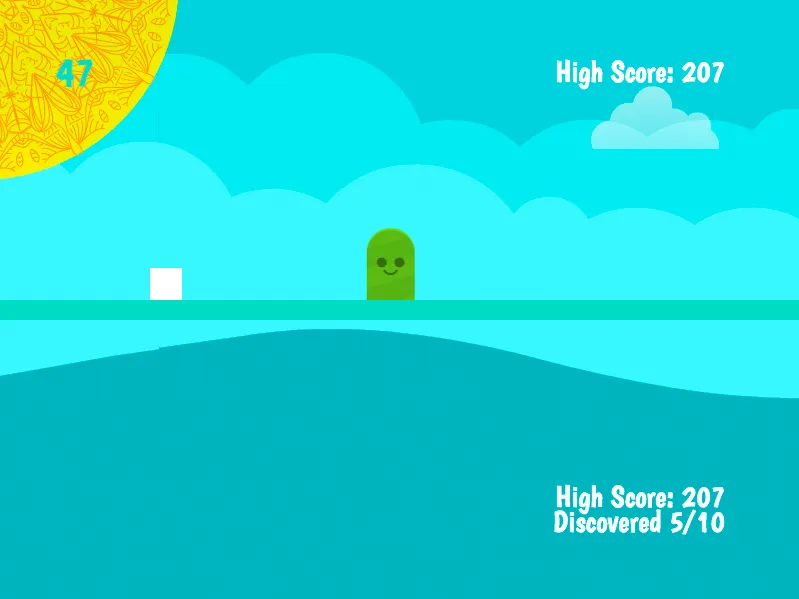
Due to being quite busy at work recently, I haven't been working much on my runner game as much, so this post is about some design decisions that went into making it.
Some things are clearer than others
The art style of the game is very colourful, so to distinguish obstacles from collectables I made the collectables plain, solid-coloured squares. This also meant that collectable sprites were very quick to create, which helped in being able to quickly produce a lot of different powerups.
I also decided that not all of the collectables would be beneficial, and ended up with three general categories:
- collectables which are helpful, either by getting rid of obstacles or helping the player avoid them entirely, like the laser, or the upside-down powerup;
- collectables which neither helped nor hindered, like changing the entire game to greyscale or changing the jump to a backflip;
- collectables which make the game trickier, for instance the double-time powerup, or visual filters which make obstacles more difficult to see.
I wanted to have these different powerup categories to add a bit of choice and decision-making into the game: when every powerup was beneficial in some way, the game quickly started to get boring since you'd automatically try to collect every powerup which then meant the obstacles were no longer a challenge. By having collectables which may not necessarily help, the player needs to think about whether they want to trigger the powerup or not. Similarly, some powerups replace the jump (for instance, the laser) which prevent the player from being able to collect point-giving star collectables, which also adds a decision about whether they want to be able to destroy obstacles in a huge explosion or try to collect the stars to go for a high score.

I kept the collectable sprites very similar in appearance, only differing in colour, to contribute to this "should-I-shouldn't-I" thought process: if it's not immediately obvious what a powerup is going to do, especially if you've never encountered it before, then you may think twice about collecting it rather than automatically trying to collect every one which appears.
Having said that, some of the feedback I've had about the collectable blocks has mentioned the lack of clarity about powerup effects as a negative. If players think that a powerup may have a negative effect, then the end result is that they might start avoiding every powerup just in case, which would then make the game boring (which is what the ambiguity is trying to solve!). Colourblind players may also have problems distinguishing between different powerups, which could make the game feel incredibly arbitrary if it seems as if the same powerup creates different effects with no warning.
I don't really want to add an icon to each collectable to make it absolutely clear what it's going to do; I think this would mean that players would completely ignore some collectables and just get the high-powered helpful ones instead (ie the laser!). It is clear though that they need to be more distinguishable from each other, so I may try adding patterns or effects which hint at what their effect might be.
I also had some feedback that some players assumed the collectable sprites were more obstacles, so I should probably make the fact that they should be collided with clearer. I've tried to indicate that they're a good thing to collide with by making them appear at the same level as the star collectable, and move in the same way, which is different from all the obstacles in the game. Hopefully updating the sprites as mentioned above will help indicate that the collectables are good things to collide with.
Push the button
One of the main decisions I made at the start of the game is that the entire control scheme should be one button. The only action you can take is to avoid the obstacles, and since this is a 2D side-scrolling game, vertical movement is the only way to avoid them.
Having a single way to interact with the game gave a nice constraint - powerups should either provide an alternative way to avoid the obstacles (for instance, by destroying them), or should not affect the way the player can avoid them (ie don't break the jump mechanic!).
Despite having only one thing to do though, the game still needs to be interesting and fun to play, otherwise it could be played just by metronomically tapping the 'up' key, which doesn't sound like much fun. As such, replacing the jump with another interaction adds a bit of variety, as well as meaning the player needs to make a decision between being able to jump, and so collect star powerups which provide a lot of points, or replacing the jump with a powerup which will help them to survive longer.